学习之前的困难
主要困难就是不知道该怎么修改样式,因为我看到的官网组件样式都是下面这样,黑白两色,我感觉自己不能直接使用,但是又不知道该怎么修改样式,于是就卡住了。这和我之前使用的ant-design和elementUI都有很大的区别。

区别到底在哪里呢?仔细想一想,区别就在与颜色不是我所熟悉的,也就是说我不能像在elementUI里面一样,直接复制粘贴代码,就达到我的需求。而是需要我来配置。从官网可以看到,shadcn的默认主题就是黑白色。https://ui.shadcn.com/themes。

这个配置就难倒我了,react里面我还没有写过项目呢,真的不知道该在哪里配置整个项目的样式。那么学习了这个课程之后,我就知道了,主题颜色值是在app/globals.css里面进行配置的,而大小、字体颜色等等可以直接在组件里面配置。至于布局,可以直接使用tailwind写在组件的className里面。可能还有更多配置方式,我还有继续发掘。
组件和globals里面的样式还可以添加,这样自主性就相当大了,而我之前真的是没有经历过这种写法,我都是直接使用开箱即用的库,看来自主性高了,对我的挑战非常大啊。
Introduction & Setup
shadcn可以用在react项目里面,可以自定义组件,非常方便。
创建一个项目npx create-next-app lesson1,像Codevolution里面创建即可。然后安装shadcn,npx shadcn@latest init,选择Slate作为基础颜色,这个后面可以改,然后安装成功。
安装之后,会由两个新文件,并且app/global.css文件会被更改。

新文件lib/utils.ts,这个文件里面有一个辅助函数cn,这个函数的作用是shadcn将tailwind的样式类添加到shadcn组件中。
新文件components.json,这个文件是shadcn的配置文件。
修改了app/global.css,添加了shadcn的样式变量,用来设置shadcn的组件样式。
在app/global.css里面添加一些样式:
xxxxxxxxxx121main, nav {2 @apply max-w-6xl mx-auto my-12;3}4p {5 @apply mt-2;6}7h1 {8 @apply scroll-m-20 text-4xl font-extrabold tracking-tight lg:text-5xl;9}10h2 {11 @apply scroll-m-20 border-b pb-2 text-3xl font-semibold tracking-tight transition-colors first:mt-0;12}然后把page.tsx和layout.tsx的内容改一下:


npm run dev启动项目,效果:

Card components
从老师的代码里面拿到_data/db.json文件,放到项目最顶层里面。

另外开一个terminal,安装json-server,npm i -g json-server,然后运行起来json-server --watch ./_data/db.json --port 4000。

这样就创建了restful api接口了,接口像这样请求:

然后编写app/page.tsx文件,在这里使用shadcn的Card组件来展示:
xxxxxxxxxx311// app/page.tsx23interface Recipe {4 id: string;5 title: string;6 image: string;7 time: number;8 description: string;9 vegan: boolean;10}1112async function getRecipes(): Promise<Recipe[]> {13 const result = await fetch("http://localhost:4000/recipes")1415 return result.json();16}1718export default async function Home() {19 const recipes = await getRecipes();20 return (21 <main>22 <div className="grid grid-cols-3 gap-8">23 {24 recipes.map(recipe => (25 26 ))27 }28 </div>29 </main>30 );31}注意recipes.map里面就是要写的内容。
文档:https://ui.shadcn.com/docs/components/card。
新开一个terminal,npx shadcn@latest add card,安装Card组件,安装完成之后,会发现这个组件自动放到app/components/ui文件夹里面去了,非常贴心。

按照文档的案例,导入Card。

然后copy案例的组件代码:

将实际数据加进去:
xxxxxxxxxx301export default async function Home() {2 const recipes = await getRecipes();3 return (4 <main>5 <div className="grid grid-cols-3 gap-8">6 {7 recipes.map(recipe => (89 <Card key={recipe.id}>10 <CardHeader>11 <CardTitle>{recipe.title}</CardTitle>12 <CardDescription>13 {recipe.time} mins to cook.14 </CardDescription>15 </CardHeader>16 <CardContent>17 <p>{recipe.description}</p>18 </CardContent>19 <CardFooter>20 <button>View Recipe</button>21 {recipe.vegan && <p>Vegan!</p>}22 </CardFooter>23 </Card>2425 ))26 }27 </div>28 </main>29 );30}效果:

下面就是重点了,shadcn之所以很多人推荐使用,除了引入的是单个组件而不是整个组件库之外,另一个重要原因就是更改shadcn组件的样式非常方便,只需要在组件上使用tailwind来修改即可,不需要担心样式的权重,不需要使用:deep来加强权重,这就省了很多事情了。
xxxxxxxxxx321export default async function Home() {2 const recipes = await getRecipes();3 return (4 <main>5 <div className="grid grid-cols-3 gap-8">6 {7 recipes.map(recipe => (89 <Card key={recipe.id} className="flex flex-col justify-between">10 <CardHeader className="flex-row gap-4 items-center">11 <div>12 <CardTitle>{recipe.title}</CardTitle>13 <CardDescription>14 {recipe.time} mins to cook.15 </CardDescription>16 </div>17 </CardHeader>18 <CardContent>19 <p>{recipe.description}</p>20 </CardContent>21 <CardFooter className="flex justify-between">22 <button>View Recipe</button>23 {recipe.vegan && <p>Vegan!</p>}24 </CardFooter>25 </Card>2627 ))28 }29 </div>30 </main>31 );32}效果:

实际上效果不是很好,content的顶部没有对齐,底部左右的文字也没有对齐,这些先不用管。
Badges, Buttons & Avatars
这节课学习badge、button、avatar组件。先安装npx shadcn@latest add button badge avatar。现在来看一个重点,在button.tsx是文件中,有一个buttonVariants的变量,里面有一些属性可以供我们设置button不同的样式。这里默认的是shadcn提供的样式,我们可以在组件里面添加样式,这样风格就可以很简单的统一了。
比如说在variants.variant里面添加third: "bg-red ......",那么我就可以这样使用了<Button variant="third"></Button>。甚至在variants里面也可以直接添加属性对象,比如说textSize : {default: "font-24"},要记住可以这样使用。

像这样使用:

可以供有限的设置样式吧。
引入:
xxxxxxxxxx31import { Avatar, AvatarImage, AvatarFallback } from "@/components/ui/avatar";2import { Badge } from "@/components/ui/badge";3import { Button } from "@/components/ui/button";从老师的代码中,复制粘贴public/img文件夹。编写组件:
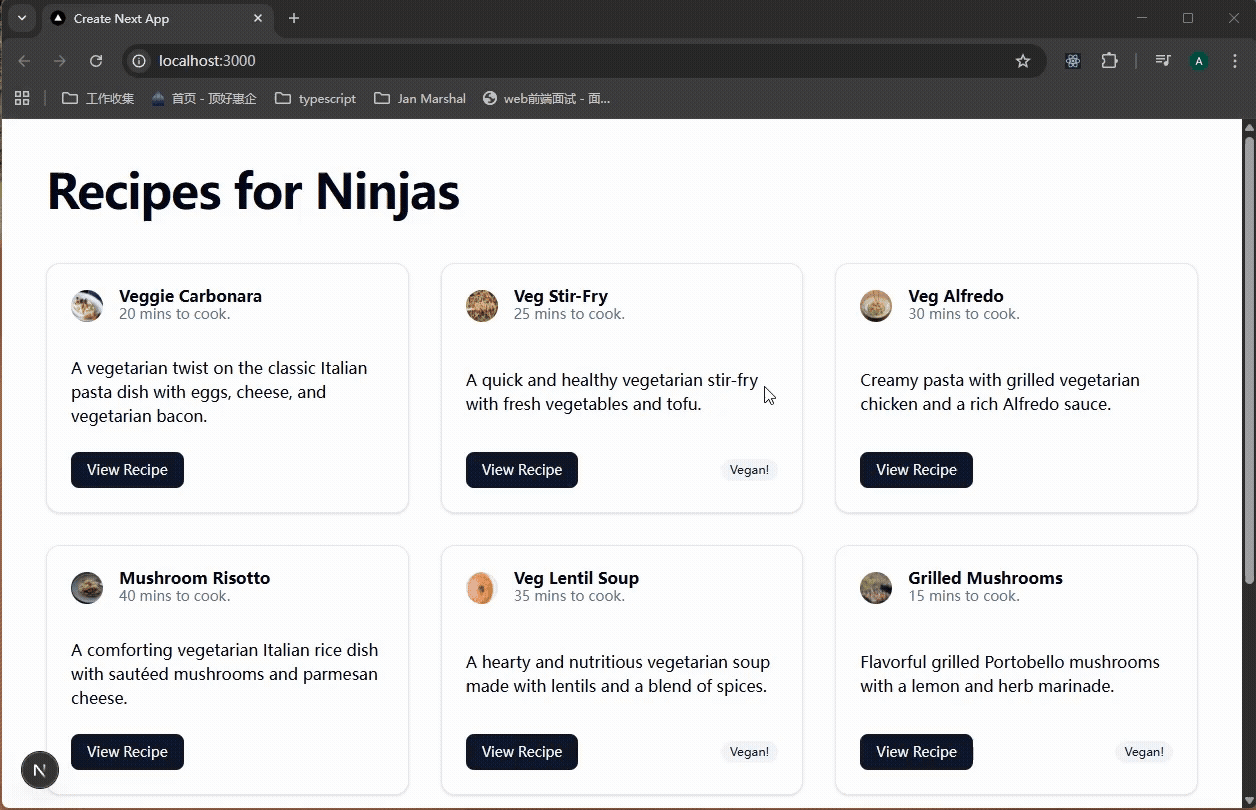
xxxxxxxxxx381export default async function Home() {2 const recipes = await getRecipes();3 return (4 <main>5 <div className="grid grid-cols-3 gap-8">6 {7 recipes.map(recipe => (89 <Card key={recipe.id} className="flex flex-col justify-between">10 <CardHeader className="flex gap-4 items-center">11 <Avatar>12 <AvatarImage src={`/img/${recipe.image}`} alt="recipe img" />13 <AvatarFallback>14 {recipe.title.slice(0, 2)}15 </AvatarFallback>16 </Avatar>17 <div>18 <CardTitle>{recipe.title}</CardTitle>19 <CardDescription>20 {recipe.time} mins to cook.21 </CardDescription>22 </div>23 </CardHeader>24 <CardContent>25 <p>{recipe.description}</p>26 </CardContent>27 <CardFooter className="flex justify-between">28 <Button>View Recipe</Button>29 {recipe.vegan && <Badge variant="secondary">Vegan!</Badge>}30 </CardFooter>31 </Card>3233 ))34 }35 </div>36 </main>37 );38}效果:

Skeleton Components
怎么理解Skeleton这种组件呢?其实就是一种loading的效果,只不过把样式结构更加具体的显示出来了。那么在nextjs里面,怎么显示loading效果呢?希望我能够记起来,就是创建一个loading.tsx文件即可。
那么就是在loading.tsx里面,使用shadcn的Skeleton组件。为了能够复用Skeleton,所以创建一个单独的组件components/SkeletonCard.tsx,就是模仿真实Card的样式。安装npx shadcn@latest add skeleton。
xxxxxxxxxx291// components/Skeleton.tsx23import {4 Card,5 CardContent,6 CardFooter,7 CardHeader,8} from "@/components/ui/card"9import { Skeleton } from "@/components/ui/skeleton"1011export default function SkeletonCard() {12 return (13 <Card className="flex flex-col justify-between">14 <CardHeader className="flex gap-4 items-center">15 <Skeleton className="h-12 w-12 rounded-full" />16 <div className="space-y-2 flex-auto">17 <Skeleton className="h-4" />18 <Skeleton className="h-4" />19 </div>20 </CardHeader>21 <CardContent>22 <Skeleton className="h-8 flex-auto" />23 </CardContent>24 <CardFooter>25 <Skeleton className="h-10 w-24" />26 </CardFooter>27 </Card>28 )29}然后在loading.tsx中使用它:
xxxxxxxxxx151// app/loading.tsx23import SkeletonCard from "@/components/SkeletonCard";45export default function loading() {6 return (7 <main>8 <div className="grid grid-cols-3 gap-8">9 {Array.from({ length: 9 }, (_, i) => i + 1).map(recipe => (10 <SkeletonCard key={recipe} />11 ))}12 </div>13 </main>14 )15}在app/page.tsx里面获取数据时,添加延时。查看效果:
Color Themes
shadcn使用oklch颜色值,可以在app/global.css里面看到shadcn定义的一些样式值。

如果要全局的改样式,那么就在这里更改。shadcn也提供了一些样式值供参考:https://ui.shadcn.com/themes,选择需要的主题颜色,点击copy code,将代码粘贴到项目中。


我选一个Yellow色,替换项目中的globals.css的shadcn相关内容,看一下效果:

有了颜色,我就感觉生动太多了。